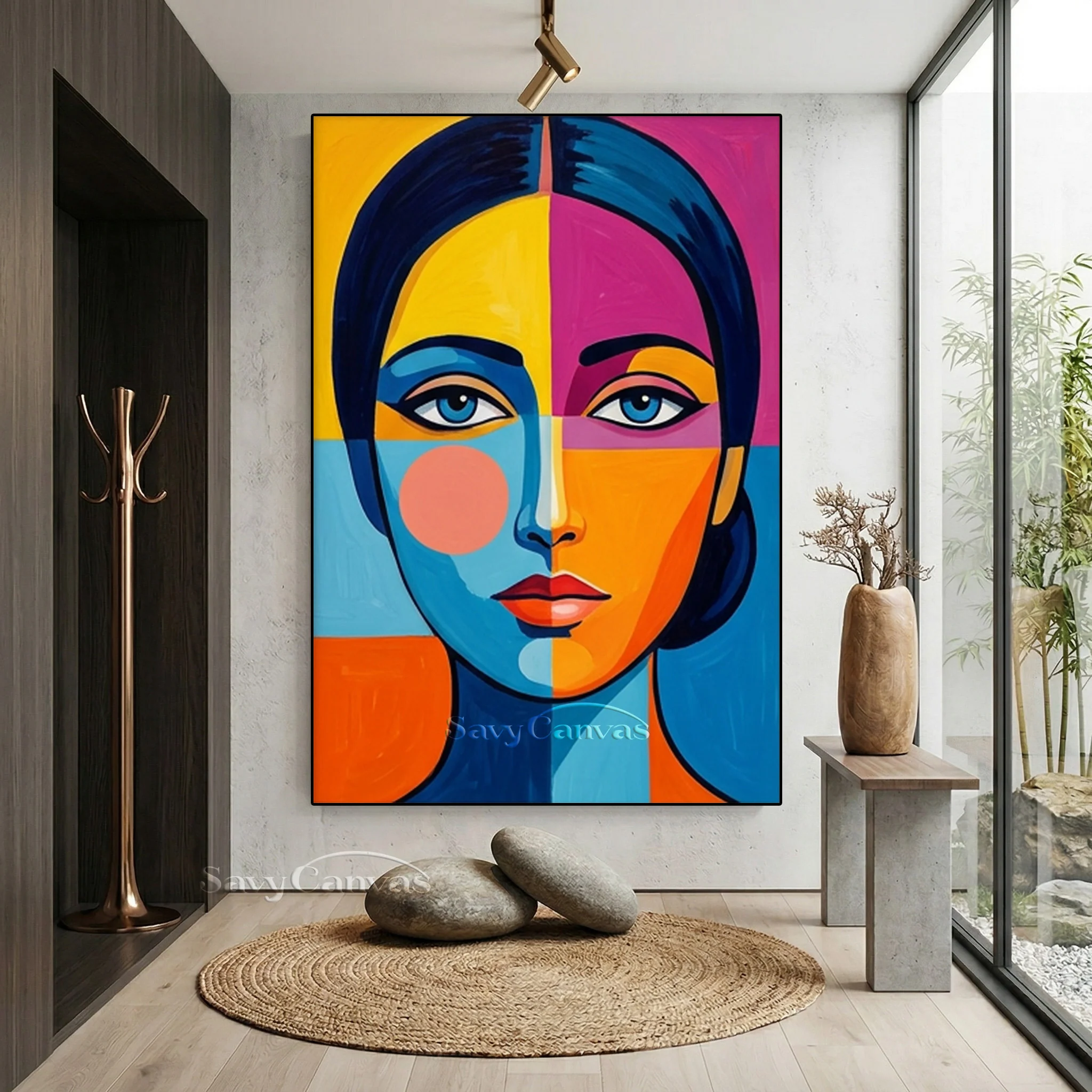
Color plays a powerful role in how people experience and interpret art. It can communicate emotions, establish visual balance, attract attention, and influence the overall atmosphere of an artwork. In modern artistic styles, few movements demonstrate the expressive potential of color as effectively as Pop Art. Recognized for its striking contrasts, simplified imagery, and energetic compositions, this movement transforms familiar subjects into visually memorable works.
The relationship between color and composition becomes especially interesting in Pop Art Oil Painting, where traditional painting techniques meet the graphic influence of popular culture. Oil paints allow artists to explore vibrant shades, textured surfaces, and carefully blended tones while maintaining the bold appearance associated with the movement. This combination creates artwork that attracts attention and encourages viewers to examine its details more closely.
Understanding the Role of Color in Pop Art
Pop Art emerged during the 1950s and became widely influential throughout the 1960s. Artists began drawing inspiration from advertisements, comic books, consumer products, celebrities, and other elements of everyday culture.
Bold colors became an important part of the movement’s identity. Rather than relying primarily on naturalistic color schemes, artists often selected exaggerated shades to create immediate visual impact.
Bright reds, electric blues, vivid yellows, and contrasting greens helped distinguish Pop Art from many traditional artistic styles. These choices also reflected the colorful commercial imagery that influenced the movement.
Color was not simply decorative. It became a way to communicate ideas, establish emphasis, and influence how viewers understood familiar subjects.
Why Bold Colors Matter in Pop Art Oil Painting
Strong colors help create the recognizable visual language of Pop Art. Their effectiveness comes from the way they interact with shapes, outlines, backgrounds, and subject matter.
Creating Immediate Visual Attention
Bright and contrasting colors naturally attract the eye. Artists use this quality to emphasize important subjects and guide viewers through a composition.
For example, a vivid red object against a yellow or blue background can become the central focus of a painting. The contrast creates visual separation without requiring complicated details.
This approach is particularly useful when artists want to communicate an idea quickly through recognizable imagery.
Expressing Emotions Through Color
Different colors can influence the emotional atmosphere of an artwork. Although individual interpretations vary across cultures and personal experiences, certain color associations are widely recognized.
- Red: Often associated with energy, excitement, passion, or urgency.
- Yellow: Can suggest optimism, warmth, and enthusiasm.
- Blue: Frequently communicates calmness, stability, or contemplation.
- Green: May represent nature, freshness, or balance.
- Black: Creates contrast and can introduce drama or visual definition.
Artists can combine these colors to create compositions that feel playful, energetic, dramatic, or reflective.
Establishing Contrast and Balance
Contrast helps distinguish individual elements within a painting. Pop Art artists often place complementary or opposing colors together to create strong visual relationships.
However, effective compositions require more than simply using bright shades. Artists must consider proportion, placement, and the relationship between foreground and background elements.
A carefully balanced arrangement allows bold colors to work together without making the artwork visually confusing.
The Importance of Strong Visuals and Recognizable Imagery
Alongside color, recognizable imagery is one of the defining features of Pop Art. The movement frequently uses subjects drawn from familiar cultural experiences.
These may include:
- Celebrity portraits and entertainment personalities.
- Comic book characters and illustrated scenes.
- Consumer products and commercial packaging.
- Advertising symbols and brand-inspired imagery.
- Everyday household objects.
- Fashion, music, and popular media references.
Using familiar subjects creates an immediate connection with viewers. People may recognize an object or cultural reference before examining the artistic techniques used to represent it.
This accessibility is one reason Pop Art continues to attract audiences with different levels of artistic knowledge.
How Oil Painting Enhances Bold Visual Elements
Oil painting introduces traditional artistic qualities that can make Pop Art compositions more complex and expressive.
Its flexibility allows artists to experiment with color intensity, surface texture, and visual depth.
Rich Pigmentation and Color Saturation
Oil paints are valued for their rich pigments and ability to produce strong, vibrant colors. Artists can apply them in different ways to achieve both intense color areas and subtle tonal variations.
This makes oil painting suitable for compositions that depend on striking contrasts and distinctive color relationships.
Layering and Color Blending
Oil paints dry relatively slowly compared with many water-based painting materials. This gives artists additional time to blend colors and refine transitions.
They can build multiple layers to adjust the appearance of a surface or create more complex visual effects.
These techniques allow painters to introduce depth while maintaining the simplified forms associated with Pop Art.
Texture and Brushwork
Texture adds another dimension to bold visual compositions. Artists may use smooth applications of paint for clean graphic areas and more visible brushstrokes for expressive details.
The contrast between these surfaces creates an interesting relationship between commercial-inspired imagery and traditional painting craftsmanship.
The Influence of Contrast in Pop Art Composition
Contrast is essential to creating strong visuals. It helps organize a composition, distinguish important subjects, and maintain the viewer’s interest.
Pop Art artists use several types of contrast to achieve these effects.
Color Contrast
Placing contrasting colors next to one another makes individual shapes and objects more noticeable. Complementary color combinations are particularly effective for producing energetic visual effects.
Light and Dark Contrast
Differences between highlights and shadows help establish depth and emphasize important details. Even simplified compositions can benefit from carefully controlled tonal differences.
Shape and Line Contrast
Bold outlines, geometric shapes, and simplified forms create visual structure. These elements help viewers identify subjects quickly and understand how different parts of the composition relate to one another.
Repetition and Pattern
Repeated shapes, images, or color arrangements create rhythm within an artwork. This technique is closely associated with the visual language of classic Pop Art.
Famous Artists Who Demonstrated the Power of Bold Visuals
Several influential artists helped establish the relationship between strong visuals and popular culture.
Andy Warhol
Andy Warhol became famous for his colorful celebrity portraits and repeated images of consumer products. His use of vivid color combinations demonstrated how familiar subjects could become visually striking through changes in repetition and presentation.
Roy Lichtenstein
Roy Lichtenstein incorporated comic book aesthetics into large-scale artworks. Thick outlines, Ben-Day dots, expressive colors, and dramatic compositions became important features of his visual approach.
James Rosenquist
James Rosenquist drew inspiration from advertising and commercial imagery. His large-scale compositions combined fragmented objects and contrasting visual elements to reflect the influence of mass communication.
These artists demonstrated that visual simplicity and bold color could communicate complex cultural ideas.
The Role of Bold Pop Art in Modern Interior Design
Strong colors and recognizable imagery make Pop Art an interesting choice for contemporary interiors. A carefully selected painting can introduce personality into a room and create a focal point without requiring extensive decoration.
In minimalist environments, vibrant artwork can provide contrast against neutral walls and simple furniture. In more colorful interiors, it can complement existing decorative elements or reinforce a particular design theme.
When incorporating Pop Art into an interior, consider the following factors:
- Wall color: Choose artwork that either complements the existing palette or creates a deliberate contrast.
- Room proportions: Select a painting size that suits the available wall space.
- Furniture arrangement: Avoid placing too many visually dominant objects around the artwork.
- Lighting conditions: Appropriate lighting helps reveal color variations and surface details.
- Overall atmosphere: Consider whether the artwork should create an energetic, playful, or more balanced environment.
These considerations help maintain visual harmony while allowing expressive artwork to stand out.
How Contemporary Artists Are Exploring New Color Possibilities
Modern artists continue to expand the visual language of Pop Art through changing cultural influences and new creative methods.
Digital photography, advertising, social media, and online entertainment provide a growing collection of visual references. Artists may use these influences as starting points before translating their ideas into traditional oil paintings.
Some contemporary interpretations feature unconventional color combinations, exaggerated proportions, and layered compositions. Others use more restrained palettes while retaining the movement’s recognizable graphic qualities.
Despite these developments, bold color and strong visual communication remain central to the style.
Tips for Appreciating Color and Composition in Pop Art
Viewing Pop Art becomes more rewarding when attention is given to the decisions behind its visual appearance.
Instead of focusing only on bright colors, consider how different elements work together. Observe which colors dominate the composition, how the artist creates contrast, and where the viewer’s attention is directed.
It is also useful to examine the relationship between imagery and meaning. A familiar commercial object may appear simple at first, but its presentation can communicate ideas about consumer behavior, celebrity culture, or modern society.
Finally, look closely at the painting’s surface. Brushwork, layering, and variations in paint thickness reveal how traditional oil techniques contribute to the overall visual experience.
Conclusion
Bold colors and strong visuals are fundamental to the identity of Pop Art. They transform familiar subjects into engaging compositions while allowing artists to explore cultural references, emotional expression, and creative experimentation.
When combined with traditional oil painting methods, these visual qualities gain additional depth through rich pigmentation, layered surfaces, and expressive brushwork. This balance between modern imagery and established craftsmanship continues to make Pop Art an influential and recognizable form of artistic expression.